Monday, August 19, 2013

50% Grey Midpoint in Maya Diplacement

Maya displacement is something that I avoid using as much as possible.

I've always maintained that my reluctance is because I don't have much experience with sculpting (Though I've used Mudbox a little bit), and that no matter how I do it, greyscale displacement maps never look as nice as a normal map.

That being said, I've discovered that greyscale normal maps don't import into Maya correctly (to my view).

Logically, I would expect a value of 50% grey to not change the displacement of an object at all, while white would be the equivalent of 100% displaced up, and black 100% displaced down.

Maya by default takes black as no displacement and white as 100% displaced up.

In order to fix this, you need to put the following formula into the Alpha Offset slot of the file node which holds the displacement image:
=-0.5*%FILE%.alphaGain
Where %FILE% is the name of the file node (or texture node if you're not using a file). We use the value of -.5 to shift the midpoint down 50% from white to mid grey. 

Your displacement should now work correctly.

Tuesday, November 1, 2011

Book Review: Alive Character Design by Haitao Su

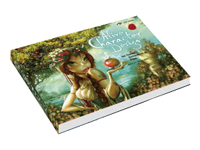
Six months ago, Alive Character Design by Haitao Su was officially released. Then the date was pushed back, then it was published, then it was unavailable. I finally have this book sitting on my desk and can write a review.


While waiting for it to be released, I’ve pored over a number of extracts from it, which were very interesting and some of which were quite helpful and instructive on their own. Unfortunately, the included extracts are possibly the best information in the book.

The views expressed are quite narrow, applying for the most part only to traditional cartooning styles and very cliché archetypes, bringing to mind the narrow Disney character designs and their very set formulas.

‘Alive Character Design for Game, Animation and Film’ covers the principles of character design, but it is a very rudimentary explanation, mostly covering tools and software rather than actually going over how to construct interesting characters. This is the only time the book discusses character design as an overall whole, and the section is all and all only about eight pages of the hundred and seventy odd which the book boasts.

From there it goes into character categories:

Female Characters – here the author has decided female characters are entirely and exclusively about “creating distinctive sexuality and beauty”. Every character in this section and explanation is about large-breasted, narrow-waisted women in provocative poses wearing revealing outfits. Absolutely nothing about diverse character traits or different ages. I note here that while “Female characters” lumps together all female characters ever. Apart from one or two very brief mentions, female characters are not revisited.

Male Characters - “Highlighting the Character’s Heroism” implies you are going to get a very shallow view, and that is pretty much what the section is, filled only with heroic male characters. Almost everything in this section looks the same and all focuses on the “heroic” style character. “Male Characters” is really only “Heroic Male Characters” and has about three other sections devoted to male character types.

Q-Style Character Design – here the author delves into the design of cute and cuddly characters. This one is a bit more diverse, covering very young characters, very old ones, male and female, animals and monsters. But it has the feel of an art book more than an instructive text, sprinkled with the odd tip but nothing overly useful.

Monster Character Design – This section I found a bit more useful, the leg positioning stuff was good (which is in the below preview), but the comment associated with it isn’t about centre of balance or drawing on animals to work out anatomy but instead talks about the attitude of a character, which I think is a bit less relevant to why the pose is wrong.

Animal Character Design –The majority of this section focuses on taking animals and personifying them with ridiculous outfits. This isn’t entirely what I wanted to lean about giving animals character. I wanted to know how to do that without turning them into puss in boots.

Supportive Role Characters – “Make them Stupid and Ridiculous”, I downright disagree with this. Making supporting characters stupid and ridiculous is not always required in a storyline, and making idiotic supporting characters doesn’t exactly expand my knowledge of how to use supporting characters and the diversity of plot tasks they can accomplish, or even how to design a supporting character without detracting from the main character.

Villains – This section gets into it a wee bit more, talking about lighting villains and the type of gestures you can imply. Some of the facial expression information is good too, but it’s all a bit light and missing in content.

Inanimate Characters – Here the book discusses personified inanimate characters. The idea is distilled down into five approaches which are explained in detail. These include examples, but the examples are all of different things using different approaches and you have to really understand what the words are inferring to understand the examples and it can be a bit confusing.

Mechanical Character Design – This section discusses different type of humanoid mechanical robots. There are only two minor illustrations in this section which are not humanoid, which is again a very shallow view for such an important and broad topic. Again we get a bit lost in the generic details, like giving robots personality and the idea of AI and cyborgs. All well and good but it’s not really explaining how to combine real-world inspiration into unique characters.

Next there is a “Gallery Appendix” which is some sort of out of place promo for five random cartoonists. The reason there are included is not mentioned, and why it is referred to as an appendix is beyond me. I am guessing they are cartoonists who inspire the author, or perhaps helped fund the book, but nothing is ever mentioned and the category merely includes a photo, name, brief biography and a whole bunch of examples of their work.

This is followed by a two page interview which is more a background and biography of Haitao Su rather than anything useful. It’s a bit lengthy and conducted in an interview format rather than an address from the author to the reader.

Finally an acknowledgement….and then it just kind of ends. No final words of wisdom or suggestions on how to tie everything together. It leaves you confused and more than a little dissatisfied.

In Summary

Perhaps the reason I disliked this book so much was my six month wait after the first time a release date was announced for the thing to actually be published and released. Based on the previews I’d seen, I was very excited and looking forward to recommending this book. “Alive Character Design for Game, Animation and Film”, the title promised so much and delivered very little. It struck me more as an art book with the occasional word of wisdom to impart than a proper learning guide.

Maybe I was just expecting too much. I still haven’t found a proper character design book which explains how to create believable, memorable and detailed characters, something which teaches me how to decide on costuming, age, gender, traits and personality. I guess I just wanted this book to explain everything to me, not just narratively but visually. How to illustratively build characters with extra legs, strange joints, missing limbs while making them look like they anatomically correct.

Overall, a great disappointment. While I can’t argue that Haitao Su is a great artist, his overall approach to the subject was very limited and haphazardly compiled, confusing and very cliché. This is combined with a halting and sometimes overcomplicated way of wording and discussing topics which makes me think it was done by a translator rather than the impassioned words of the artist. Not a book I’d recommend for learning much, though the pictures are quite pretty.

Tuesday, August 16, 2011

Learn to Animate with the free Animation Insiders ebook!

Animation is not an easy art to master, and getting resources to study it can be very expensive, and it can be hard to know what's good advice and what isn't.

If you're passionate about animation and have a piggybank to smash open, I recommend The Animator's Survival Kit by Richard Williams, a genius and master of the art. It's industry standard for aspiring animators and is packed full of useful tips and diagrams (we all know how hard it is to read massive blocks of text).

BUT, if you want to learn a bit more economically, the crew at Squeeze Studio have released their own book, Animation Insiders - Workflow edition.


This book is packed with brilliant advice, tricks and tips, with a focus on workflow, the step by step of how the contributing animators work. Best of all, You can download it for free from Squeeze Studio!

Check it out :)

Wednesday, June 22, 2011

Brilliant Lighting Book: Light for Visual Artsits by Richard Yot

Light for Visual Artists by Richard Yot

A few weeks ago I finally received my copy of Light for Visual Artists by Richard Yot. I wasn't really sure what to think of this book, as it wasn't squarely aimed at 3D artists, but is a bit more of a general reference.

It really is a marvelous book for 3D artists. Although it doesn't hold your hand and show you how to create each effect in 3D, it's a great resource listing many types of light and examples of each.

It covers basic studio lighting setups, outdoor and indoor light, natural light, various shadow properties, the way light reacts to different types of materials like chrome and translucent objects, colour bleeding and everything in between. I especially love the way each type of lighting discussed comes with the same picture of a white ball on a white background, so you can compare with other chapters and study the differences.

Although many of the subjects covered are not new, and anyone who has studied light in a decent capacity will probably know most of the contents, this book still has fantastic value as a reference tool, a cheat sheet for whatever you're working on.

I'm very impressed and would recommend this to anyone interested in lighting, both in 3D, 2D, and even film/photography.

Here's a link to the Publisher's website where you can see some example pages and a chapter list, and a link to Richard Yot's website where he's got a lot of great content under the tutorials section.

Tuesday, June 21, 2011

An Introduction to the Facing Ratio Property.

This is probably an old trick, but it can be a bit confusing how to hook it up, so I thought I'd pop a brief outline on here.

The Facing Ratio trick is a great way to simulate lots of things where a lighter colour is required around edges. It's good for making glass, velvet, car paint and fake subsurface scattering out of standard Maya shaders, and I'm sure there are other uses for it too.

I'm just going to give you the basics of how to hook this up.

You need a sampler info node from the Utilities rollout in your hypershade, and a ramp texture.

It's all really simple, middle mouse drag the sampler info node in your work area to the ramp texture node.

A menu will appear, asking how you want to connect the nodes, just click other. The connection editor will pop up, and you want to click facingRatio on the left and connect it to uCoord or vCoord (expand the uvCoord rollout) depending on how your ramp is set up (vCoord for a V Ramp, uCoord for a U Ramp, doesn't matter which way you do it).

This will now place the top colour of your ramp facing the camera, and the bottom colour just around the edges facing sideways from the camera.


From here you can plug it into anything you like, Incandescence and colour works well for velvet, but play around with it and see how you go. It can probably be used in conjunction with mia shaders for some cool effects too.

Don't forget you can map each selected colour in your ramp with other nodes!

Friday, June 17, 2011

Our Film "Keeping Station" is Live!

Finally our 48hour film, Keeping Station, is live and available for you all to watch.

It was all done with paper puppets, after effects sets and a bit of 3D here and there.

We’re proud of the style on this one! Next year we'll work harder to get the story across.


Toowit Toowoo Intro from Toowit Toowoo on Vimeo.

Tuesday, June 14, 2011

sIBL: Fast, Free and Fabulous-looking Image Based Lighting

Today it's my birthday, and what better way to celebrate it than to give you all a present!

I found this neat little program/script/plugin for 3D applications called sIBL.

Image based lighting is a great way to integrate your 3D models into a real-world photo and create a realistic lighting environment for your CG work. Unfortunately, while it’s not hard to set up (in Maya at least), neither is it easy to get it looking great while still rendering very quickly.

sIBL is an external tool, independent of any 3D software which creates fast and splendid looking scripts for various 3D packages to encorporate image based lighting. Best of all, it’s absolutely free.

The team at HDR Labs also have a big library of free HDRIs tailored for use with sIBL that are easy to use and look fantastic.

I had a brief play with it for our paper puppet film, Keeping Station, and it worked perfectly. So at the risk of sounding like their marketing department is paying me, check it out!

Monday, June 13, 2011

A Quick Tip for Faces

Today I wanted to share something that one of my workmates showed me. Whether you’re doing 2D or 3D art, faces are really important to get looking right. We stare at them every day of our lives and we notice when they look a little bit off.

Dean made a great observation about hue shifts through the face. Due to the way blood vessels are grouped, colours are different in various areas. The bottom jaw and lip area takes a slightly bluish tinge, the nose and cheekbones a pinky red tone, and the forehead (being mostly bone) is slightly yellower.

Here’s a quick paintover to illustrate my point. This is one of my older characters. On the left, she’s been painted in a standard way with a skin shader. On the right, I’ve overlaid a slight hue shift through her face, which instantly gives a lot more life and volume to it. It’s probably a bit strong but I wanted to make it easier to see.

Try it out with your own work and see how you go!

Coloration Difference

Tuesday, May 31, 2011

Toowit Toowoo Team Intro

Still not allowed to upload the film yet, but here's the intro. We enjoyed making this and will try to do something cooler for next year. Film is coming up this weekend hopefully, so here's the intro for now:

Toowit Toowoo Intro from Toowit Toowoo on Vimeo.

Thursday, May 26, 2011

Keeping Station: Behind the scenes of our new film

As you may or may not know, last week I was involved in the annual V48Hours Film Contest here in New Zealand, which gives you from Friday evening to Sunday evening to make a short film using a number of compulsory elements. There is to be no story making or shooting prior to this weekend, which makes it a huge challenge, and a lot of fun!

Our team, Toowit Toowoo, consisting of about 11 core members, did a mixed-media film largely based around marionette puppets made of paper! We also incorporated 3D and lots of visual effect.

The 2 minute long film we made, 'Keeping Station' will premiere at the Academy theater in Auckland during the 21st heat of the competition on Sunday. A few weeks after that, we will pop it online and I will link it from here.

Here's the poster:
Film Poster

And for now, enjoy some Making Of photos we took during the weekend:

Setting up our hardest shot
Some dramatic lighting
Our director thinking hard

Some discussions about VFX shots
Compositing